Playing with Telegram data
Intro
Telegram allows you to export data from all chats you have. I used this feature to make a personalized gift to a friend of mine, by plotting a few graphs and combining them with pictures and texts inside a nice paperback notebook.
The book didn’t have a title, but if it had it could have been something like “an illustrated data-based analysis of our friendship”.
Obviously I won’t show it here, because it contains personal things, but I’ll show some plots (or parts of plots) that I did with various chats, to illustrate what can be done with Telegram data. The code can be found here.
Step 1 - Download messages
There might be many options to download all your conversations, but since I also wanted all the pictures and audio messages I had to use Telegram Desktop. Just download it, set it up and go to the Settings.
Click on Advanced settings, specify the folder where you want your data to be saved and click on Export Telegram data. Select what you want to download and choose the JSON format before clicking on Export.
That’s it! You should have a nice result.json file saved in a folder called DataExport_dd_mm_year.
The json file looks like this:
{
"about": "Here is the data you requested. ...",
"chats": {
"about": "This page lists all chats from this export.",
"list": [
{
"name": "Somebody",
"type": "personal_chat",
"id": 4295744296,
"messages": [
{
"id": 642,
"type": "message",
"date": "2018-10-09T19:32:23",
"from": "Julie Ducasse",
"from_id": 653911985,
"text": "Hello :) !"
}
]
}
{... another set of messages from someone else ...}
]
}
}
Step 2 - Import & convert json into a data frame
The first thing we need to do is to import that file into R and find the chat we’re interested in.
“text” can be either the message itself (i.e. a string) or a list containing information regarding pictures, links, etc. To keep it simple I worked on text messages only, so I filtered out non-character texts.
Of course, there’s more information to look at (number of pictures, links, number of answers, etc.) if you’d like to!
data <- fromJSON(file = "result.json")

data.chat <- list.filter(data[["chats"]][["list"]], # Get lists of chats
                      .[["name"]] == "MyFriend") # Replace with the right chat name
data.messages <- data.chat[[1]][["messages"]] # Get messages from that chat

getText <- function(x) { # Only retrieve messages
  if (typeof(x[["text"]]) != "character") return("")
  return(as.character(x[["text"]]))
}

json <- data.messages %>% {
  tibble( # Get the three pieces of info we want.
    date = map_chr(., "date"),
    from = map(., "from"),
    text = map_chr(., getText)
  ) %>%
  filter(!(text == ""), !is.na(from))# Filter out some data without info
}
That’s it! We just add a few more columns to make it easier to work with dates, using Lubridate.
The column week indicates the beginning of the week during which the message was sent. For example a message sent on Wednesday January 8 is assigned the value of: Monday January 6.
json <- json %>%
  mutate(week = floor_date(ymd_hms(date),unit = "weeks",
                           week_start = getOption("lubridate.week.start", 1)),
         hour = hour(ymd_hms(date)),
         wday = wday(ymd_hms(date), label = TRUE, abbr = FALSE))
We also create factors from the variable from: there should be only two levels: your name, and your friend’s name.
json$from = factor(json$from, levels = unique(json$from))
By now, you should have a nice data frame containing only the messages you’re interested in.
> print(as_tibble(json), n = 1)
# A tibble: 5,323 x 6
  from            date                text   week                  hour   wday
  <fct>           <chr>               <chr>  <dttm>                <int>  <ord>
1 FriendName      2018-11-22T23:28:59  Hi !  2018-11-19 00:00:00    23   Thursday
# … with 5,322 more rows
Now it’s time to see what it is all about!
Step 3 - Visualise it!
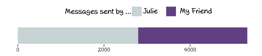
Find out who is the most talkative.
We just count the number of messages for each person and display a very simple graph. If this is not a one-way relationship the bars should be more or less equals ;)
json_talkative <- count(json, from)

ggplot(json_talkative, aes(x = "", y = n, fill = from)) +
  geom_bar(stat="identity", position = "stack") +
  coord_flip() +
  scale_fill_manual(values  = c("orange", "#954535"),
                    name = "Messages sent by ...",
                    guide=guide_legend(reverse=T)) +
  theme(panel.grid.major = element_blank(),
        axis.ticks.y = element_blank(),
        panel.background = element_blank(),
        legend.position = "top",
        axis.title = element_blank())
This should output something like this: (whew! it’s a balanced relationship :) )
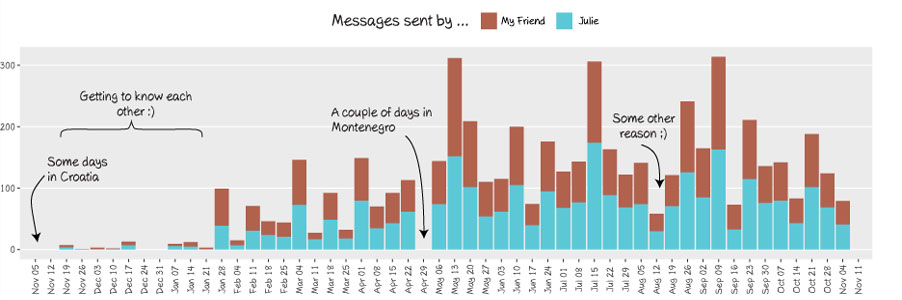
Find out when and why you didn’t speak to your friend.
The next plot shows the number of messages per week and its interpretation is interesting: low bars can indicate that you and your friend got distant for a while, or that you were actually spending so much time together that there was no need of texting each other :)
By looking at a plot for my friend L. I could very easily identify weeks during which we went on holidays together and weeks during which I was so busy visiting Slovenia with my friends and relatives that I completely let her down… Sorry L. !
week.count <- count(json, week, from)

ggplot(data = week.count, aes(x = as.Date(week), y = n, fill = from)) +
  geom_bar(stat = "identity") +
  scale_x_date(date_breaks = "week", date_labels = "%b %d",
               expand = c(0.05,0)) +
  theme(panel.grid.major.x = element_blank(),
        panel.grid.minor = element_blank(),
        axis.text.x = element_text(angle = 90, vjust = .5),
        legend.position = "top",
        axis.title= element_blank()) +
  scale_fill_manual(values  = c("#B1624EFF", "#5CC8D7FF"),
                    name = "Number of messages sent by ...") +
  expand_limits(y = 0)
To make graphs prettier I like to export them as PDF and edit them using Illustrator. Here is an example (incorrect and incomplete for privacy reasons :) )
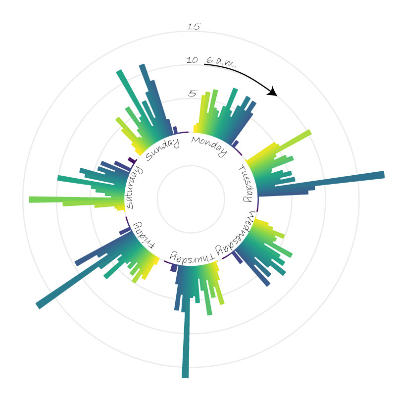
Find out at what time of the day your friend needs your more :)
I must admit that the following graph isn’t the most readable one… But I really wanted a circular plot and couldn’t resist. Each bar shows the average number of messages sent for that weekday and that time.
We just refactor the variable “hour” so that for each weekday the first bar represents the beginning of the day (6 a.m.) and the last bar represents the end of the night.
json_time <- json %>%
  group_by(week, wday, hour) %>%
  summarise(n = n()) %>%
  group_by(wday, hour) %>%
  summarise(mean = mean(n)) %>%
  complete(hour = seq(0,24,1), fill = list(mean = 0))

json_time$hour <- factor(json_time$hour, levels = unique(json_time$hour))
json_time$hour <- fct_relevel(json_time$hour, c("0", "1", "2", "3", "4", "5"),
                                after = Inf)
json_time$wday <- fct_relevel(json_time$wday, c("Monday", "Tuesday", "Wednesday",
                                        "Thursday", "Friday", "Saturday", "Sunday"))

ggplot(json_time, aes(x = wday, y = mean, fill = as.numeric(hour), colour = hour)) +
  geom_bar(stat = "identity", position = "dodge") +
  coord_polar() +
  scale_y_continuous(breaks = seq(-10,30, 10), limits = c(-10, max(json_time$mean))) +
  scale_fill_viridis_c(direction = -1) +
  scale_color_viridis_d(direction = -1) +
  theme_minimal() +
  theme(
    legend.position = "none",
    panel.grid.major.x = element_blank(),
    panel.grid.minor.x = element_blank(),
    axis.text.y = element_blank(),
    axis.title = element_blank()
  )
Here is an example of what you can get after some processing in Illustrator. There’s a regular peak around 11 a.m. when my friend and I decide whether we’ll go for lunch together or not. And I’m sure there’s no peak on Monday evening because we usually go for lunch together on Mondays, so we probably don’t have many things to say to each other thereafter!
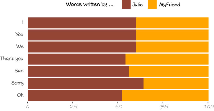
Find out who is the most egocentric / grateful / whatever
To do this, we first define a list of words we are interested in. I just picked a few basic words for this page but any word could give interesting results.
Then, we loop through this list and for each word we create two rows containing the number of occurences of that word: one row for yourself, and one row for your friend.
words <- c(" i ", "you ", "we ",
                 "yes|yeah", "no |nope",
                 "sorry",
                 "ha ha|haha|ah ah|ahah|he he",
                 "thanks|thank you",
                 "coffee")

labels <- c("I", "You", "We", "Yes", "No", "Sorry", ":)",
            "Thank you", "Coffee")

subset.friend <- tolower(as.character(filter(json, from == "FriendName")$text))
subset.me <- tolower(as.character(filter(json, from == "Julie")$text))

colnames <- c("Word", "From", "Count")
df.words <- setNames(data.frame(matrix(ncol = 3, nrow = 0)), colnames)

for (i in seq(1:length(words))) {
  fromFriend <- sum(str_count(subset.friend, words[i]), na.rm = TRUE)
  fromMe <- sum(str_count(subset.me, words[i]), na.rm = TRUE)
  rowFriend <- setNames(data.frame(labels[i],"My Friend",fromFriend), colnames)
  rowMe <- setNames(data.frame(labels[i],"Julie",fromMe), colnames)
  df.words <- rbind(df.words, rowFriend, rowMe)
}

df.words.pct <- df.words %>%
  group_by(Word) %>%
  mutate(percentage = round(Count/sum(Count)*100))
Making the plot is straightforward:
ggplot(df.words.pct, aes(x = Word, y = percentage, fill = From)) +
  geom_bar(stat="identity", position = "stack") +
  coord_flip() +
  scale_fill_manual(values  = c("orange", "#954535"), name = "Words written by ...") +
  scale_x_discrete(limits = rev(levels(df.words.pct$Word))) +
  labs(y = "", x = "") +
  scale_y_continuous(expand = c(0.01,0))+
  theme(legend.position = "top",
        panel.grid.major.y = element_blank(),
        axis.ticks.y = element_blank(),
        axis.text.y = element_text(vjust = .3),
        panel.background = element_blank(),
        plot.margin = unit(c(0,1,0,0), "cm")) +
  guides(fill = guide_legend(reverse = TRUE))
Here is an example: it turns out that I’m the one being slightly over-apologetic :). And you probably noticed that “I”, “You” and “We” got the exact same percentage: believe or not, but it actually comes from real data. Out of thousands of messages. Pretty nice, isn’t it?
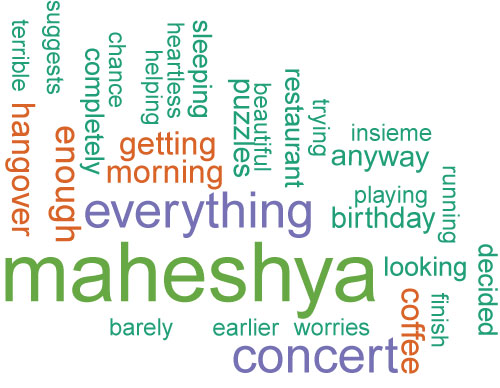
Find out the most frequent words in your conversations
The example provided here for the wordcloud package works perfectly. Just follow the instructions and you will get a nice word cloud.
all <- paste(as.character(json$text))
all <- str_replace_all(all,"[^[:graph:]]", " ")
docs <- Corpus(VectorSource(all))

docs <- tm_map(docs, content_transformer(tolower)) # Convert the text to lower case
docs <- tm_map(docs, removeNumbers) # Remove numbers
docs <- tm_map(docs, removeWords, stopwords("english")) # Remove english common stopwords
docs <- tm_map(docs, removeWords, c("listtype")) # specify your stopwords as a character vector
docs <- tm_map(docs, removePunctuation) # Remove punctuations
docs <- tm_map(docs, stripWhitespace) # Eliminate extra white spaces

dtm <- TermDocumentMatrix(docs, control=list(wordLengths=c(6,Inf)))
m <- as.matrix(dtm)
v <- sort(rowSums(m),decreasing=TRUE)
d <- data.frame(word = names(v),freq=v)

set.seed(1234)
pdf("wordcloud.pdf", width=6, height=8.5)
wordcloud(words = d$word, freq = d$freq, min.freq = 1,
          max.words=200, random.order=FALSE, rot.per=0.35,
          colors=brewer.pal(8, "Dark2"))
dev.off()
I created one word cloud with 6 months of conversation with one of my colleagues (aka CC) and I found it nice that:
- the words “terrible” and “hangover” are so close to each other (and I definitely don’t use that word, so who is the one to blame?), and
- we care so much about our other colleague, Maheshya :)